Monday, 16 December 2013

Rough Cut

A rough cut is important to consider as it allows you to understand what direction the music video is going in, therefore allowing you to make a clear judgement and understand what the strengths and weaknesses are of the music video. It is a good idea to share a rough cut with audiences so that you can gain audience feedback. This is helpful to understand what parts of the music video audiences enjoy and can relate to. Likewise, you can gain an understanding of what parts of the music video need improving.


We recieved feedback by uploading our music video to youtube. I then promoted this by sharing the youtube link on facebook:


I chose to post the video on facebook as facebook is one of the most popular social networking sites, therefore by doing this our video would be presented to a wider audience and gain more feedback. I recieved very positive comments on this link and also many likes.


I did recieve some constructive critisim also, such as: "Perhaps you could alter the contrast/colour within the death scene to make it look more tense and proffesional". This is definitely something I will take into consideration as I would like the death scene to be as powerful as possible. Somebody also suggested altering the titles to make it look more proffesional. Again this is something I will take into consideration as I wanted to music video to look as proffesional as possible, however I would like to keep the large 'Georgia Ray' title as this style of title is very modern as tends to appear alot in recent music videos.

From watching the rough cut, I would personally like to make some alterations to the final sequence after the bonfire section. Rather than showing clips of drugs and alcohol, I think it would be nicer to show memories of the artist and her boyfriend when they were together. I think that showing drugs and alcohol after the boyfriend has died is irrelevant and unessessary and would be more effective to show previous clips of the relationship (good times or bad) to represent and reflect on the artist's state of mind.

Other than these alterations I am very pleased with our music video and it seems as though public audiences do too. Creating a rough cut is definitely a productive way to allow yourself and audiences to view your product and work out what could be improved, consequently making the best of your product.

Friday, 6 December 2013

Digipak Analysis

The purpose of a digipak is to engage the audience and persuade them to buy the product. A  digipak is different to a CD as it contains more slides therefore provides the audience with more information about the artist and the album.

The following image is a digipak of Mumford and Sons' album "Sigh No More". Much like Nina Nesbitt's tour advertisement, Mumford and Sons use very light and naturalistic colours. This represent their music as it conveys their light and acoustic sound. It is noticable that the shop that they are standing in is painted white whereas the ones next door are darker, this is so that they stand out as a band and are immediately spotted.

The design/layout is very well thought out. The use of an old and distressed street/shop adds an edginess to the digipak, presenting the band as unique, much like the use of a distressed brick wall in the Nina Nesbitt avertisement. The fact that the band are holding their musical instruments represents their performing and songwriting ability. This is conventional to the indie genre as it presents them as music artists rather than a star or image, and therefore realtes to an indie audience. I think that the layout is also very poignant. The band themselves are placed slightly off center and are displayed in a small window, so therefore aren't necessarily the main focus point. I think that the first thing you notice when you look at the digipak is the name "Mumford and Sons" with the album name underneath, as the title is actually bigger than the image of the band. This is conventional the indie genre as it is promoting the album name and the band's music, rather than promoting the band as an image, which goes against Dyer's Theory. This represents the band as songwriter's with a musical talent and informs the audience that their intention is to make music, rather than sell themselves as a product. This would interest an indie audience.  The font used for the title is quite formal and authentic. This represents the band's music and shows that their songs and sound holds a lot of authenticity and realism.


Tuesday, 3 December 2013

Magazine Advert Analysis

The purpose of magazine advertising is to inform audiences, to sell a product and to build the name recognition. Within the following tour advertisement, Nina Nesbitt is represented as a pop artist, however is specifically edging towards the indie genre. This representation is evident because of the choice of colours, images, design and typography.

Lighter colours are used throughout this advert, such as green, light blue and cream. These light colours are conventional to Nina Nesbitt as an artist as her music is very light-hearted and acoustic. The choice of image is very poignant and is a great representation of the artist. The image shows Nesbitt standing neutrally with her hands by her sides looking at the camera. However, she isn't posing. This presents Nesbitt as a very naturalistic artist. It also presents her as an indie artist as it shows the audience that she isn't trying to sell herself as a star or an image, she is selling herself as an ordinary person and more importantly selling her music. The layout of the advertisement is appropriate as the typography doesn't overlap the artist, therefore makes the artist the focus point as the typography almost outlines her. This layout could be used to explain to the audience that her albums and performances are all about her, in the sense that she writes her own songs, accompanies herself by playing her own instruments etc. Therefore the fact that the layout makes her the focus point proves that not only is she the performer, but she is also very much behind the scenes writing her own music also. I believe that the typography also helps represent her as a songwriter as well as a singer. To me, the font used to present her name almost looks like handwriting. This is conventional to Nina as an artist as it could be used to portray her song writing skills. As opposed to a bold, computer-generated font, I think that the font used in this advertisement definitely relates to Nina Nesbitt as an artist.


The naturalistic style to this advertisement definitely promotes and represents the music and the artist. The use of natural colours, typography, images and layout, Nina Nesbitt is presented as a talented person rather than a star or an image. This consequently gives the audience an idea of what sort of music and performances that she would produce. Her natural and ordinary style gives audiences the correct impression that she would produce more acoustic-based music and would most probably write her own songs. I think that her naturalistic representation would attract a younger audience, possibly more female-based as young women would look up to her and see her as a role model.


Saturday, 2 November 2013

Planning Lighting and Colour

Lighting is very important within the music video production. Every lighting set-up provides a specific mood, emotion, atmosphere, and aesthetics to the overall film viewing experience. Without light, it is not possible to see anything, and it is not possible to shoot a film. For example, a horror movie uses light to make the scene look sinister or eerie, whereas the lighting and colour in a children's movie would be very vibrant and colourful.

To follow the conventions of the indie genre we would like to use naturalistic lighting throughout specfic sections of the music video. During the performance section we want to film at around 2 o'clock in the afternoon so that the sun will still be up. On screen this will make the lighting look very high key which is what we want for this segment of the music video. Naturalistic lighting is something that you would tend to find within an indie music video as the indie genre likes to present a natural artist with natural surroundings. This naturalism is also relatable to the majority of audiences.

Throughout the first chorus our music video we will be displaying footage of the artist and her boyfriend, however we want to make this footage look like its a good memory from early on in the relationship that the artist is thinking about. To do this we will film at around midday so that the sun is at its highest, giving the footage a warm feel to it. We will then alter the colour in the editing process to make the footage look aged and bright, portraying happiness and positivity.

Within the second chorus, we will again be showing footage of the artist and her boyfriend, hoever this time we want the footage to look darker to connote how the relationship is turning bad. To create this feel we will be filming in the evening, to give a darker and more dangerous feel to the footage. This will contrast well with the previous sections as they will consist of lighter and more sepia toned colours, whereas this section will have low-key lighting and consist of darker colours, including the colours of our clothing and our surroundings. This decision in lighting and colour will challenge the conventions of the indie genre, as it will give off a more grungy vibe rather than indie. Thiswill hopefully give our music video a unique and original feel with an indie song contrasting with grungy visuals. However I think that this will work with the song and it's message and will still follow indie in the sense that the message of the song is being promoted rather than the artist.

The lighting and colour of a music video must be planned out very well because it contributes to the atmosphere of the music video. The lighting and colour must match the genre and your intentions on he music videos' mood, otherwise it would break the music video and won't be relatable to your target audience.


Planning Editing

Editing plays a big part with the music video production. The editing process consists of taking all of the filmed footage and placing it in a specific order by cutting the footage and using transitions. The editing style of a music video is very important as it brings your footage to life and gives it a certain atmosphere, for example: an action sequence would consist of fast pace editing and straight cuts, whereas a romantic scene would consist of slow pace editing and possibly cross-dissolve transitions. By using specific editing styles and following certain codes and conventions, you can make your product relatable to your chosen genre/target audience.


Our footage with an 'Aged' and 'Mask' effect.
To edit our music video we will be using Final Cut Pro X. I want our music video to look edgy in order to challenge the conventions of indie, therefore I will be using a lot of effects and tints when editing. During the music video there will be sections that show previous events of the artist and her boyfriend, which I will edit to look as though these are memories that the artist is thinking about. To make this evident I will use an aged effect to differentiate between the present and the memories. I will also like to use an effect called 'mask' which creates a black, feathered border. This gives the footage a 'polaroid' feel to it, implying that the footage is a memory.


Our footage with a fast-motion effect.


Another editing effect I would like to use is a fast motion effect. I think that presenting footage in fast motion (such as traffic) could portray the fast-moving relationship between the artist and her boyfriend. This effect represents the message within the song and therefore promotes the music, which is conventional to the indie genre.


Our footage with colour tints and
a cross-dissolve transition to show a
gradation in colour.


I would also like to use colour tints and cross-dissolve transitions. The bridge in the song 'The Apple Tree' is a lot slower. For this section of the song I was thinking that we could take our footage and cut it into two. The first section would have a very vivid and colourful tint, whereas the section section would have a black and white tint. I would then like to link these sections with a cross-dissolve so that it looks like the colour is being drained and taken away. This would represent the end of the relationship. This brings the lyrics of the song to life, essentially promoting the music which is conventional to indie.

I believe that it is important to plan your editing styles or at least have an idea of your editing styles since the editing process is such an important part of a music video production. It is also a very time consuming task therefore it is best to be organised.


Planning an Artist Image

The purpose of the artists image is to promote the artist in a certain fashion and allow the artist to be relatable and to build a relationship with the audience. Artists are constantly changing their image in order to put themselves in the media and to please their ageing target audience. By doing this they are also able to attract different audiences, consequently widening their fan base. Stars such as Miley Cyrus, Rihanna and Britney Spears are popular for constantly changing their style and sound.

For our music video we want to give the artist an edge. Inspired by 90's grunge, we would like the artist to look rough and rebellious instead for steering towards the predictable Nina Nesbitt indie-pop fashion. The reason for this decision is to move away from the artist that we've chosen and break the stereotypical conventions of indie-pop, therefore giving an original feel to our video.

Within our music video I (playing the artist) will be wearing different outfits consisting of garments such as flannel shirts and leather jackets (inspired from the image on the left). Clothing such as ripped jeans, bandanas and doctor marten boots will be worn to give off a rebellious vibe - conventional to our 'grunge' take on the song.

To the right is the outfit that I wore during the performance section. As you can see this outfit is inspired by the picture above, having red tartan, denim and leather jackets in common. I decided to wear an oversized jacket because Drew is seen wearing a lot of oversized clothes. This shows that my portrayal of the artist is still in love with Drew and is trying to find ways to remember him.


The hairstyle was inspired by Rihanna's "We Found Love" hairstyle as we felt that this was an edgy and unique hairstyle and isn't expected within the indie genre. Therefore by using a grungy hairstyle similar to this then we would be able to challenge and break the conventions of the indie genre.


I want Drew and I to wear similar outfits in order to show our 'bond'. I feel that by wearing similar clothes, we will display to audiences our characters affection for each other and their inseparability. For example we could both wear a lot of denim, tartan and leather. This also adds to the grungy style that we are trying to portray. It would be affective if we both wore doctor martens throughout the video, as this would again emphasise our inseparability. We feel that this would contribute to the meaning of the song and the narrative, therefore relating to indie.


In the bedroom scene I think that it would be a good idea to wear the shirt that Drew wore in camden (previously in the music video), the dark blue flannel shirt. This will show how the artist is infatuated by Drew and wants to wear his clothes to feel closer to him. Finally, for my final outfit, I want to wear something very plain to portray the artist's drain of emotion. Perhaps an oversized coat (again similar to Drew's style), a white top and distressed jeans ripped at the knees. The distress of the jeans will represent the artist's frustration and heartbreak. I feel it would be appropriate to let my hair down and messy in order to show how the artist doesn't care about anything except for the loss of her boyfriend. This adds to the emotion of the song which therefore relates to indie in the sense that it's promoting the music.


Planning Cinematography

The purpose of cinematography is to show the audience different point of views and angles throughout the music video. Camera angles, positioning and movement can display locations, iconography and the posture, expression and image of the artist. A wide variety of cinematography is used in order to capture different images and to create a narrative and relationship with the audience in order to make a music video successful.

Here are a selection of camera shots that we will be using:

Example: Mid Shot
We will be using a mid shot to show the use of a guitar within our music video. This will display our use of iconography and the use of instruments will relate to the indie genre. The mid shot will allow the audience to have a clear view of the artist singing and playing guitar and will promote the performance section of our music video. This is conventional to an indie music video as it promotes the music. This would also help the audience build a relationship with the artist as they will understand their musical talent.


Example: High-angled Establishing Shot


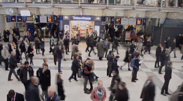
We have a particular high angle establishing shots in mind which will show the artist and the boyfriend in the middle of a crowded area with them standing still and everybody else walking around them. This would portray how they are oblivious to everything surrounding them. This therefore emphasises the narrative and the lyrics which is therefore conventional to the indie genre.


Example: Close Up
Finally, we will be using a variety of close ups. For example, here is a close up of Drew underwater. This close up allows the audience to observe Drew's facial expression, which is very blank and emotionless. This shows that he is in such a bad state of mind that he is no longer in control of his body and senses. Rather than having a dramatic death scene we felt that this was more affective as it shows that he is so mislead and unwell that he has lost control. This is conventional to the indie genre as it expresses the emotion of the song and makes the lyrics come to life. The music is therefore being emphasised which is the purpose of the indie genre.